CASE STUDY
Insights Console
PROJECT BRIEF
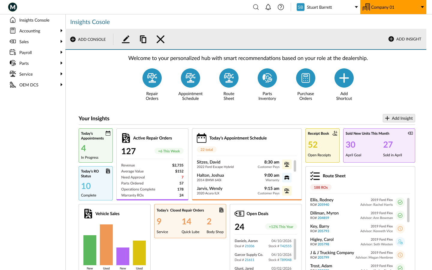
The Insights Console is a data-driven digital dashboard designed to provide users with immediate, at-a-glance visibility into operational and performance information. Serving as the central hub of the system, the console aggregates key data points across multiple modules into a single, cohesive workspace that supports informed decision-making and efficient daily workflows.
CLIENT NEEDS
Offer modular, customizable, permission based widgets
Add new insights that encompass all modules including accounting, sales, service, parts, and payroll
Leverage current APIs to drive real-time and contextual data, ensuring accuracy and relevance
USER NEEDS
Personalize the experience based on role, preferences, and business needs
Create and manage multiple consoles to support different roles, responsibilities, or areas of focus
Visibility into product inventory levels, highlight items requiring immediate attention, and recommend relevant training resources to support ongoing development
PHASE 1: Discovery
We evaluated the legacy dashboard to establish a clear picture of existing constraints and align on business objectives and desired outcomes for the next iteration of this console.
What needs to change: the widgets occupy more real estate than necessary for the data provided, limiting the amount of information available at a glance
What is possible: expand insights beyond the service and sales modules, and their three reporting categories
What matters most: provide users with behavior-based insights into the information they frequently use, modernize the design to meet updated style standards
PHASE 2: Definition


Accounting Clerk
Post vehicle sales
Process customer payments
Pay vendors
Process repair orders
Post technician labor sales
Reconcile parts invoices
Handle warranty reimbursements from manufacturers
Balance daily service cash receipts
Sales Manager
Set daily or monthly sales targets
Track inventory
Monitor sales numbers:
Units sold
Gross profit per vehicle
Closing percentages
Track appointment show rates
Prospect/customer management
Service Manager
Monitor repair orders
Manage technician schedules
Review workload distribution
Warranty vs. customer pays repairs
Parts inventory and special orders
Labor hours billed
Inspection completion rates
Parts gross profit
Identified what the users need beyond the current offering:
Insights based on user role and usage patterns
Cross-module insights: service mgr. needs insights into accounting and parts
Items needing attention (e.g. a repair order that requires manager approval)
Summary of recently viewed documents (e.g. the last five deals viewed)
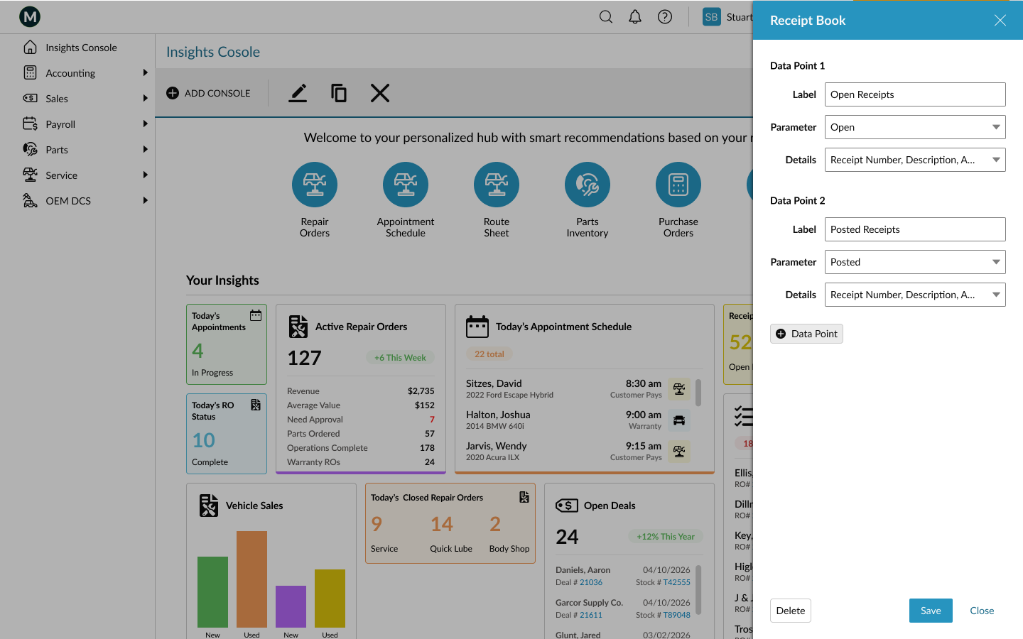
Ability to add, delete, modify, share and move insights on screen
Created user personas and their daily tasks in order to determine what insights they will need:
Accounting Clerk
Sales Manager
Service Manager
Specified project scope:
New console will be offered to users who don’t currently use the legacy dashboard
Five shortcuts based on role with ability to add more
Once parity is established for insights, legacy dashboard users will be offered the new experience with the option to toggle to the legacy experience
Add new insight types: accounting, parts, action items, continued training
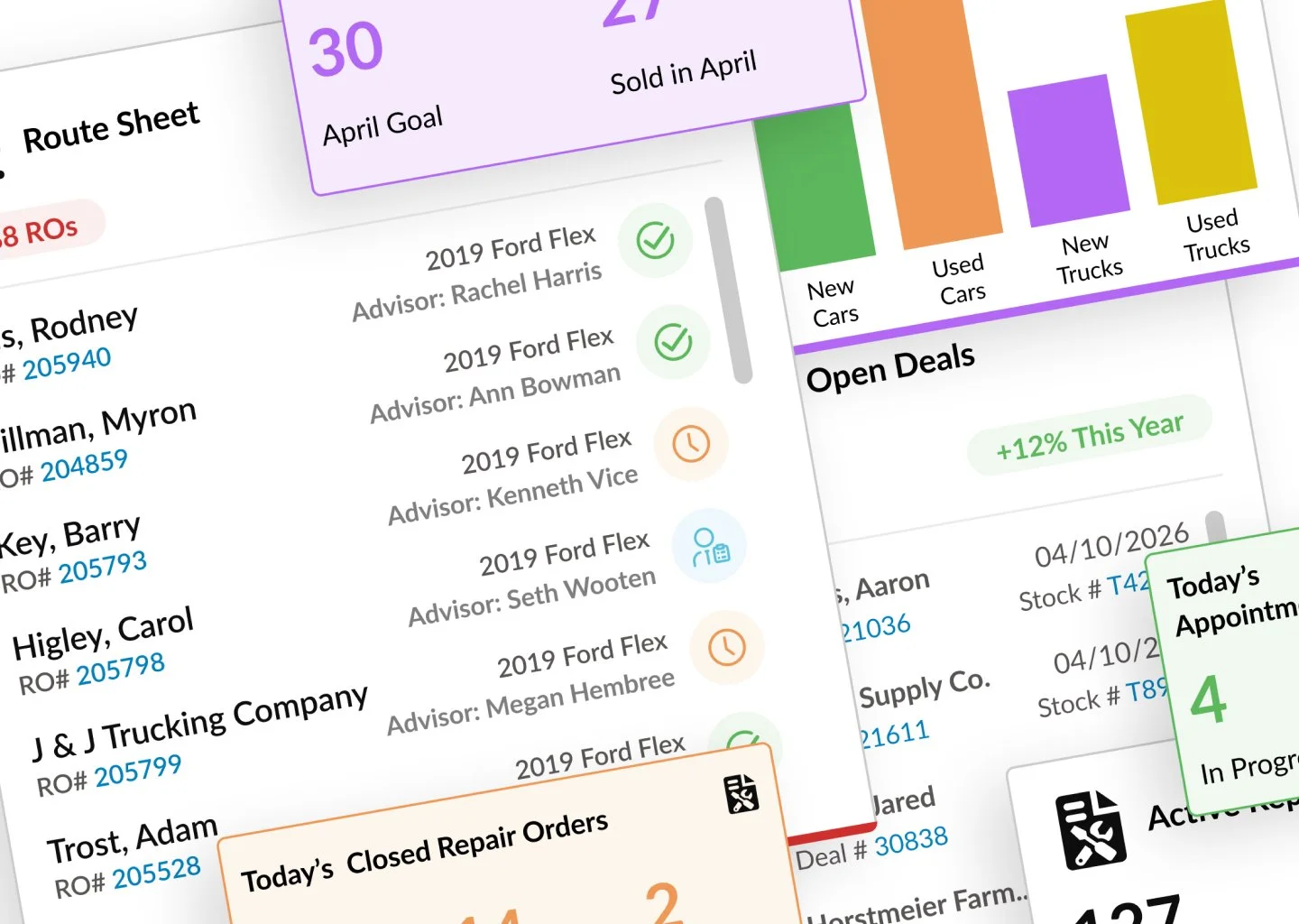
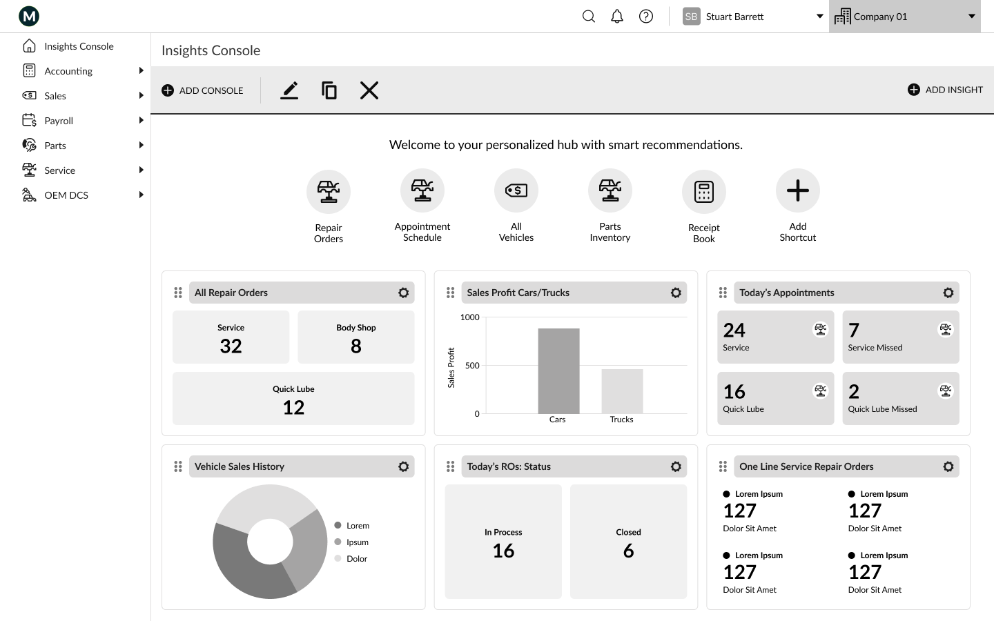
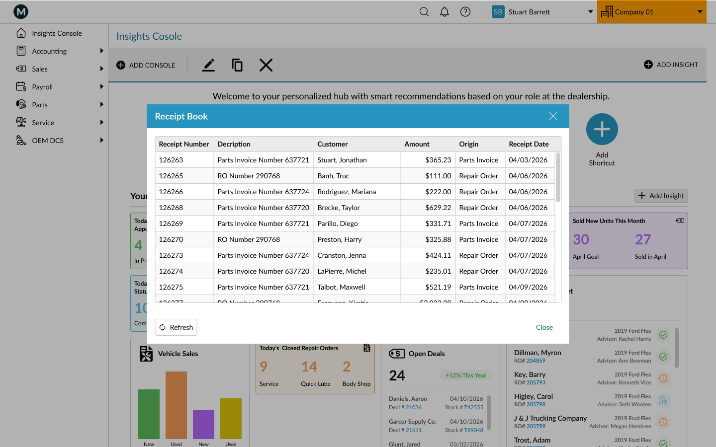
After wireframing the basic layout, I designed new widgets of varying size and content in order to best provide the insights our users need to optimize their daily processes. The prototype demonstrates interactions users can take to add, edit, move, and drill down for more detail.
PHASE 3: Ideation & Design
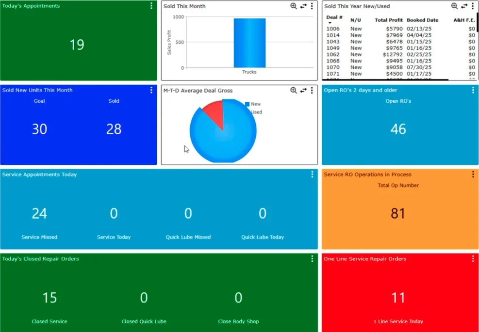
Wireframe
Prototype —>
Prototype designed in Figma. Get started for free to create an account.