CASE STUDY
Design System & Style Guide
PROJECT BRIEF
The design system will serve as a single source of truth to establish and develop comprehensive user interface standards, reusable components, and design principles, ensuring consistency and adaptability across the brand's digital products. This will enable teams throughout the organization with varying roles, skills, and expertise to maintain a reliable brand identity using assets that offer a cohesive user experience. The style guide will focus on specific guidelines for typography, color palettes, and imagery.
CLIENT NEEDS
Continuity among Agile teams
Collaborative features
Streamlined workflow
Easy transition from designers to developers
USER NEEDS
Quick prototyping
Reusable assets
Implementation of variables
Fast conversion from light to dark modes
PHASE 1: Planning & Strategy
The design team conducted research and decided to switch from their current design tool, Adobe XD to Figma. The cloud-based framework, collaborative capabilities, extensive plugin library and seamless workflow meant that the design system could more closely align with how the components are developed within the company’s proprietary software.
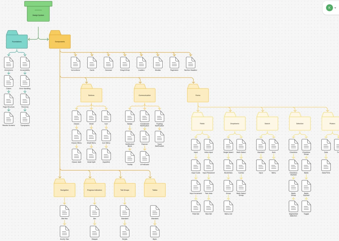
The team assessed the current design system and prototypes to devise a strategy for building the new design system in Figma. We began by creating a file structure that included style foundations, components grouped by use and variables.
PHASE 2: Establishing Foundations
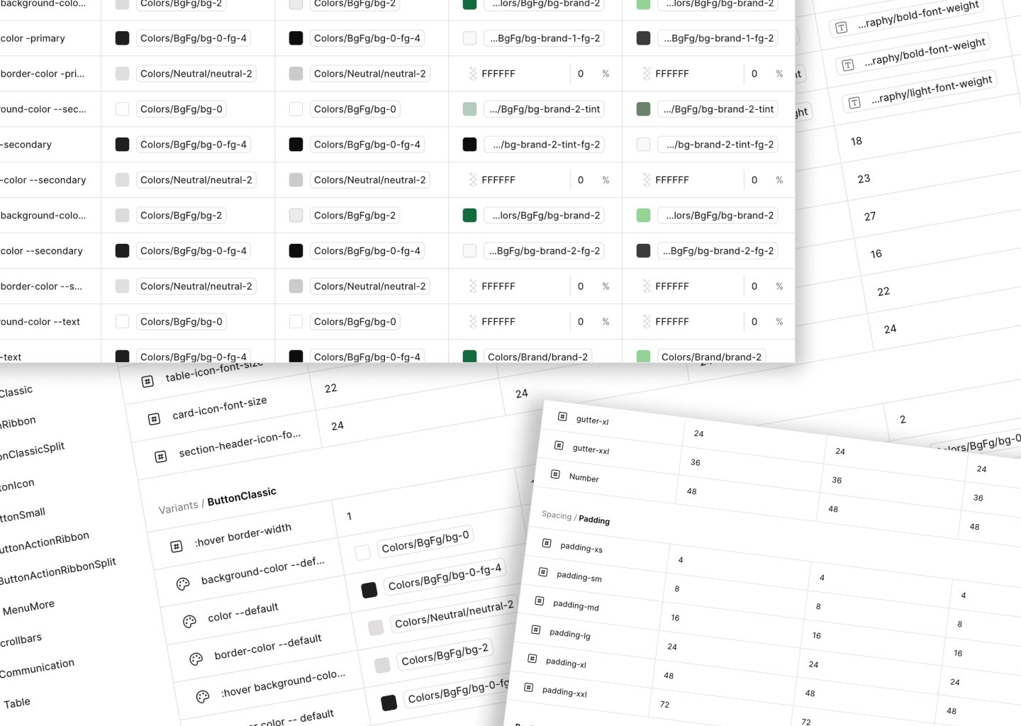
Because we had an iteration of the design system in XD, color, typography and spacing guidelines were already established. The major change to the foundations was adding variables. Not only do variables offer reusable values that save designers time and effort, but they coordinate with the components’ production code setup. Variables also allow designers to quickly switch between color modes. In the previous design system, a second prototype would be required to show a different color mode.
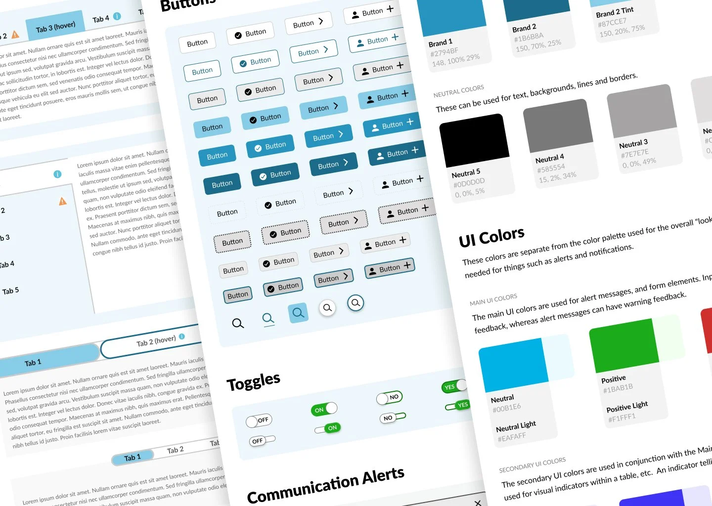
PHASE 3: Building Components
We adopted the concept of atomic design methodology which establishes a hierarchy of assets starting with the most basic component like a button and builds to a complete structure like a web page. So that we could start building prototypes before the project was complete, we began constructing the components that were used most frequently.
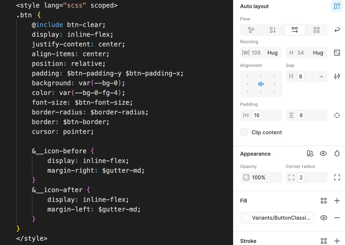
We set up the Figma components to mimic their coded counterparts, allowing prototypes to be passed to developers with little translation. This required examining the source code to determine the size, spacing, and color variables used, and whether other components were nested. We found that this review uncovered occasional discrepancies in the code that developers later fixed.